
In this article you will know how to create Responsive Card Grid Layout. You can create Responsive Cards with both Flexbox and CSS Grid. I have already created Card Layout using Flexbox.
Now I will tell you how you Responsive Card Layout with CSS Grid. CSS Grid is a two-dimensional layout system that allows developers to create grid-based layouts for both rows and columns.
How to Create a Card Layout Using CSS Grid Layout
A layout system that enables the creation of complex, flexible, and responsive designs with ease. Card Layout using grid layout provides a robust and intuitive way to design complex structures without relying heavily on traditional float or positioning properties.
With CSS Grid, developers can easily achieve responsive designs that adapt to various screen sizes.
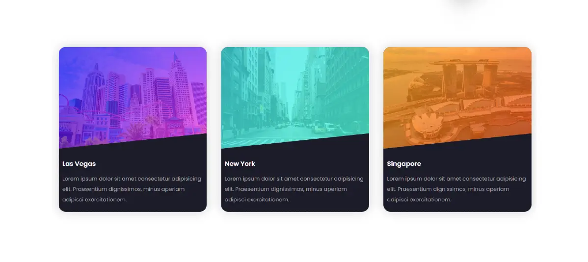
See the Pen Untitled by Growthpanda (@Growthpanda) on CodePen.
I have used 3 cards in this Responsive Card Grid Layout. In case of desktop the cards are positioned horizontally. When it opens on mobile it will be positioned along the vertical.
Step 1: Responsive Card HTML Code
To start building our responsive card layout, let’s create a simple HTML structure. Each card will be represented by a div element with relevant content, such as an image, title, and description.
<div class="cards">
        <div class="card card1">
            <div class="container">
                <img src="https://groundtutorial.com/wp-content/uploads/2024/01/las-vegas-scaled.jpg" alt="las vegas">
            </div>
            <div class="details">
                <h3>Las Vegas</h3>
                <p>Lorem ipsum dolor ....</p>
            </div>
        </div>
        <div class="card card2">
            <div class="container">
                <img src="https://groundtutorial.com/wp-content/uploads/2024/01/newyork-scaled.jpg" alt="New York">
            </div>
            <div class="details">
                <h3>New York</h3>
                <p>Lorem ipsum dolor ....</p>
            </div>
        </div>
        <div class="card card3">
            <div class="container">
                <img src="https://groundtutorial.com/wp-content/uploads/2024/01/singapore-scaled.jpg" alt="Singapore">
            </div>
            <div class="details">
                <h3>Singapore</h3>
                <p>Lorem ipsum dolor....</p>
            </div>
        </div>
    </div>
Step 2: Grid Cards Layout CSS Code
Next, let’s create a basic CSS file (styles.css) and set up our card styles. We’ll use CSS Grid properties to define the grid layout.
*{
    padding: 0;
    margin: 0;
    box-sizing: border-box;
}
body{
    background-color: #151320;
    height: 100vh;
    display: grid;
    place-items: center center;
    font-family: 'Poppins',sans-serif;
}
.cards{
    display: grid;
    grid-template-columns: repeat(auto-fit,minmax(400px,1fr));
    padding: 20px;
    grid-gap: 40px;
}
.card{
    background-color: #1c1b29;
    border-radius: 20px;
    box-shadow: 0 0 30px rgba(0,0,0,0.18);
}
.container{
    position: relative;
    clip-path: polygon(0 0,100% 0, 100% 85%, 0 100%);
}
img{
    width: 100%;
    display: block;
    border-radius: 20px 20px 0 0;
}
.container:after{
    content: "";
    height: 100%;
    width: 100%;
    position: absolute;
    top: 0;
    left: 0;
    border-radius: 20px 20px 0 0;
    opacity: 0.7;
}
.card1>.container:after{
    background-image: linear-gradient(
        135deg,
        #0100ec,
        #fb36f4
    );
}
.card2>.container:after{
    background-image: linear-gradient(
        135deg,
        #2bdce3,
        #42ffdb
    );
}
.card3>.container:after{
    background-image: linear-gradient(
        135deg,
        #ffab1d,
        #f8501c
    );
}
.details{
    padding: 20px 10px;
}
.details>h3{
    color: #ffffff;
    font-weight: 600;
    font-size: 18px;
    margin: 10px 0 15px 0;
}
.details>p{
    color: #a0a0a0;
    font-size: 15px;
    line-height: 30px;
    font-weight: 400;
}
Creating a responsive card layout with CSS Grid offers a flexible and efficient way to design user interfaces that look great on various devices.
Comment how you like this project (Responsive Cards With CSS Grid). In the meantime I have shared many tutorials on Responsive Cards you must check them out.
Building a responsive card layout using Flexbox and CSS Grid is a great way to create a flexible and visually appealing design. Below is an example of how you can achieve this using HTML and CSS.
HTML Code:
<div class=”card-container”>
<div class=”card”>
<img src=”image1.jpg” alt=”Card Image 1″>
<div class=”card-content”>
<h2>Card Title 1</h2>
<p>This is some sample text for Card 1.</p>
<a href=”#”>Read more</a>
</div>
</div>
<div class=”card”>
<img src=”image2.jpg” alt=”Card Image 2″>
<div class=”card-content”>
<h2>Card Title 2</h2>
<p>This is some sample text for Card 2.</p>
<a href=”#”>Read more</a>
</div>
</div></div>
CSS Code:
body {
font-family: ‘Arial’, sans-serif;
margin: 0;
padding: 0;
box-sizing: border-box;
}
.card-container {
display: flex;
flex-wrap: wrap;
justify-content: space-around;
}
.card {
width: 300px;
margin: 16px;
border: 1px solid #ddd;
border-radius: 8px;
overflow: hidden;
box-shadow: 0 4px 8px rgba(0, 0, 0, 0.1);
transition: transform 0.3s ease-in-out;
}
.card:hover {
transform: scale(1.05);
}
.card img {
width: 100%;
height: 200px;
object-fit: cover;
}
.card-content {
padding: 16px;
}
.card-content h2 {
margin-top: 0;
}
.card-content p {
color: #666;
}
.card-content a {
display: block;
margin-top: 16px;
text-decoration: none;
color: #3498db;
font-weight: bold;
}
This example uses Flexbox for the overall layout and CSS Grid could be used for more complex grid-based designs if needed. The .card-container is set to flex and flex-wrap: wrap to create a row of cards that wraps to the next row on smaller screens.
Creating responsive card layouts without using media queries can be challenging because media queries are a common tool for adjusting styles based on different screen sizes. However, you can use flexible units and properties to create a layout that adapts somewhat responsively without explicit media queries.
.card-container {
display: flex;
flex-wrap: wrap;
justify-content: space-around;
max-width: 1200px; /* Set a maximum width for the container */
margin: 0 auto; /* Center the container */
}
.card {
width: 30%; /* Adjust as needed based on the number of cards per row */
margin: 1.5%; /* Adjust margin to create some spacing */
border: 1px solid #ddd;
border-radius: 8px;
overflow: hidden;
box-shadow: 0 4px 8px rgba(0, 0, 0, 0.1);
transition: transform 0.3s ease-in-out;
}
.card:hover {
transform: scale(1.05);
}