
In this article you will know how to create Neumorphism Toggle Button using HTML and CSS. You can use this design button to make your webpage more beautiful.
I have seen many more elements designed by Neumorphism Design like login form, image slider, navigation bar etc. Now it’s time to create a Neumorphism Toggle Switch using CSS.
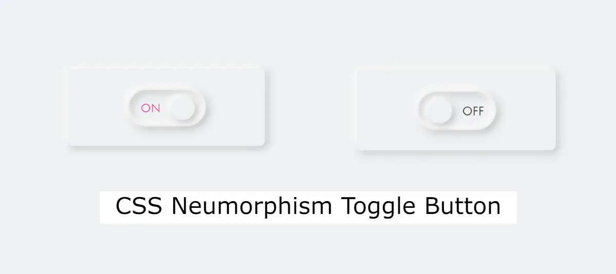
Neumorphism Toggle Switch with HTML CSS
Neumorphism, a design trend that emerged in the UI/UX world, combines elements of skeuomorphism and flat design to create a modern, soft, and three-dimensional appearance. This CSS Neumorphism Toggle Button is very easy to make.
Neumorphism adds a modern and visually appealing touch to user interfaces, and incorporating it into toggle buttons can enhance the overall user experience.
See the Pen Untitled by Growthpanda (@Growthpanda) on CodePen.
First I created a button using HTML input and then converted that input to button using CSS and added Neumorphism effect.
Step 1: Neumorphism Button HTML Code
Let’s start by setting up the HTML structure for our toggle button. Create a new HTML file and add the following code.
    <div id="container">
      <div class="box">
        <label class="switch">
          <input type="checkbox">
          <span class="slider"></span>
          <span class="on">ON</span>
          <span class="off">OFF</span>
        </label>
      </div>
    </div>
Step 2: Design the Neumorphism Toggle Switch
Now, let’s add the styles to make our Neumorphism toggle button visually appealing. Create a new CSS file (styles.css) and add the following code.
@charset "utf-8";
* {
  box-sizing: border-box;
  margin: 0;
  padding: 0;
}
html {
  font-size: 16px;
}
body {
  background-color: #ecf0f3;
  font-family: futura-pt, sans-serif;
  -webkit-tap-highlight-color: rgba(0,0,0,0);
}
#container {
  display: flex;
  align-items: center;
  justify-content: center;
  position: relative;
  width: 100%;
  height: 100vh;
}
.box {
  display: flex;
  align-items: center;
  justify-content: center;
  position: relative;
  width: 200px;
  padding: 20px;
  border-radius: 5px;
  box-shadow: -2px -2px 8px rgba(255, 255, 255, 1),
              -2px -2px 12px rgba(255, 255, 255, 0.5),
              inset 2px 2px 4px rgba(255, 255, 255, 0.1),
              2px 2px 8px rgba(0, 0, 0, .3);
}
.switch {
  position: relative;
  display: inline-block;
  width: 80px;
  height: 40px;
  cursor: pointer;
}
.switch input {
  display: none;
}
.slider {
  position: absolute;
  top: 0;
  left: 0;
  right: 0;
  bottom: 0;
  border: 2px solid #ecf0f3;
  border-radius: 20px;
  box-shadow: -2px -2px 8px rgba(255, 255, 255, 1),
              -2px -2px 12px rgba(255, 255, 255, 0.5),
              inset -2px -2px 8px rgba(255, 255, 255, 1),
              inset -2px -2px 12px rgba(255, 255, 255, 0.5),
              inset 2px 2px 4px rgba(255, 255, 255, 0.1),
              inset 2px 2px 8px rgba(0, 0, 0, .3),
              2px 2px 8px rgba(0, 0, 0, .3);
  background-color: #ecf0f3;
}
.slider:before {
  position: absolute;
  bottom: 5px;
  left: 10px;
  z-index: 999;
  width: 24px;
  height: 24px;
  border-radius: 50%;
  box-shadow: -2px -2px 8px rgba(255, 255, 255, 1),
              -2px -2px 12px rgba(255, 255, 255, 0.5),
              inset 2px 2px 4px rgba(255, 255, 255, 0.1),
              2px 2px 8px rgba(0, 0, 0, .3);
  background-color: #ecf0f3;
  content: "";
  transition: .5s;
}
.off {
  position: absolute;
  top: 14px;
  right: 12px;
  color: #3d3935;
  font-size: .8125rem;
}
.on {
  position: absolute;
  top: 14px;
  left: 14px;
  color: #f252a5;
  font-size: .8125rem;
}
input:checked + .slider:before {
  transform: translateX(33px);
}
In this tutorial, we’ve created a Neumorphism toggle button using HTML and CSS. Feel free to customize the styles, colors, and sizes to match your project’s design.
Hopefully from this article you have learned how to create a CSS Neumorphism Toggle Switch. If you want the source code then you can use the download button below.
Below is a guide on how to make a Neumorphism-style button using HTML and CSS.
HTML Code:
<button class=“neumorphic-button”>Click me</button>
CSS Code:
body {
display: flex;
align-items: center;
justify-content: center;
height: 100vh;
margin: 0;
background-color: #f0f0f0;
}
.neumorphic-button {
padding: 15px 30px;
font-size: 16px;
background: #f0f0f0;
border: none;
border-radius: 15px;
cursor: pointer;
box-shadow: 10px 10px 20px #bcbcbc, -10px -10px 20px #ffffff;
transition: box-shadow 0.3s, transform 0.3s;
}
.neumorphic-button:hover {
box-shadow: 5px 5px 10px #bcbcbc, -5px -5px 10px #ffffff;
transform: translate(2px, 2px);
}
.neumorphic-button:active {
box-shadow: inset 5px 5px 10px #bcbcbc, inset -5px -5px 10px #ffffff;
transform: translate(1px, 1px);
}