
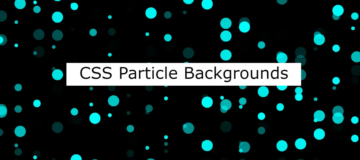
Are you looking for the best CSS Particle Backgrounds?
Here I will share you a collection of css particle animation background. These particle backgrounds, created using CSS and sometimes combined with JavaScript, bring a sense of movement and interactivity that captivates users.
In this article, we’ll explore 30 of the best particle background css that can elevate your website design to the next level.
Background Particles Animation css
Background particles animation in CSS refers to the use of cascading style sheets (CSS) to create dynamic and animated particle effects as a background for a web page or specific elements within a webpage.
CSS Moving particles background involves the manipulation of HTML elements using CSS properties and sometimes JavaScript to generate and control the movement, appearance, and behavior of particles.
Proximity Particles without Canvas
See the Pen Proximity Particles (No Canvas) by Tibix (@Tibixx) on CodePen.
Particle Background Portfolio Page
See the Pen Particle Background Portfolio Page by vabhishek.me (@vabhishek-me) on CodePen.
Particle background practise
See the Pen Particle background practise v2.1 by andreas jv (@ajv) on CodePen.
Particle background CSS
Particle background in CSS refers to the use of animated particles or small elements to create a dynamic and visually appealing background for a webpage. These particles can move, fade in and out, or respond to user interactions, adding a sense of interactivity to the website.
To implement a CSS particle background, developers commonly use JavaScript libraries or frameworks, such as particles.js, that provide pre-built solutions for creating and managing particle animations.
Here are some basic example of Particle background CSS.
CSS Bubbly Particle Background
Particles black hole with orbiting particles
See the Pen tsParticles black hole with orbiting particles by Matteo Bruni (@matteobruni) on CodePen.
CSS Particle Cloud
See the Pen Particle Cloud by Will Browning (@willbrowning) on CodePen.
CSS Particle Swarm Effect
See the Pen Particle Swarm [Magnetic Field recreation] by Bas Groothedde (@ImagineProgramming) on CodePen.
Canvas Hexagonal Particle Effect
See the Pen Canvas Hexagonal Particle Effect by Karl Saunders (@Mobius1) on CodePen.
Particle background animation
See the Pen Particle background animation by PHP Hacker (@php-hacker) on CodePen.
Glowing particle Background with text
See the Pen Glowing particle Background with text by pranjal dubey (@pranjaldub1999) on CodePen.
CSS Particle animation background
CSS Particle Animation Background typically involves creating a dynamic and animated background using pure CSS. This means that instead of relying on external libraries or JavaScript, the animation is achieved using CSS properties and keyframes.
You can customize these CSS Particle Background examples by adjusting the particle styles, animation properties, and adding more particles as needed.
Animated particle background using CSS
See the Pen How to create an animated particle background using CSS and JavaScript - the CSS-only approach by Envato Tuts+ (@tutsplus) on CodePen.
VanillaJS Background Particles
See the Pen BVAmbient - VanillaJS Background Particles by Bruno Vieira (@BMSVieira) on CodePen.
CSS Clip Clop Clippity Clop
See the Pen Clip Clop Clippity Clop [CSS Only] by Steve Gardner (@ste-vg) on CodePen.
Symmetrical Flow Fields
See the Pen Symmetrical Flow Fields by Jeremy Wentworth (@jeremywen) on CodePen.
Moving particles background css
See the Pen JS - Canvas #1 by EvonDev (@evondev) on CodePen.
Particle Background Animation
See the Pen Particle Background Test by Samurai Mac (@samurai-mac) on CodePen.
Particle background CSS
See the Pen particle background by Gurpreet Kaur (@kaurg) on CodePen.
Hope you like these CSS Particle Backgrounds designs. Comment which particle animated background you like among these designs.
Experiment, customize, and watch your website come to life with these captivating CSS particle backgrounds.
Creating a CSS-only animated background with particle effects involves using keyframe animations, pseudo-elements, and some creative styling. Below is a simple example of how you can achieve a particle effect using CSS without any JavaScript.
<!DOCTYPE html>
<html lang=”en”>
<head>
<meta charset=”UTF-8″>
<meta name=”viewport” content=”width=device-width, initial-scale=1.0″>
<title>CSS Particle Animation</title>
<style>
body {
margin: 0;
overflow: hidden;
}
.particles {
position: fixed;
width: 100%;
height: 100%;
background-color: #111;
animation: moveParticles linear infinite;
}
.particle {
position: absolute;
background-color: #fff;
border-radius: 50%;
animation: moveParticle linear infinite;
}
@keyframes moveParticles {
0% {
transform: translate(0, 0);
}
100% {
transform: translate(100vw, 100vh);
}
}
@keyframes moveParticle {
0% {
transform: translateY(0);
}
50% {
transform: translateY(-20vh);
}
100% {
transform: translateY(0);
}
}
/* Create particles dynamically with JavaScript or manually */
.particle:nth-child(1) {
top: 20%;
left: 30%;
width: 10px;
height: 10px;
animation-delay: 0s;
}
.particle:nth-child(2) {
top: 50%;
left: 70%;
width: 8px;
height: 8px;
animation-delay: -1s;
}
/* Add more particles as needed */
</style>
</head>
<body>
<div class=”particles”>
<div class=”particle”></div>
<div class=”particle”></div>
<!– Add more particles as needed –>
</div>
</body>
</html>
Creating an animated particle background involves several steps. Here’s a step-by-step guide using HTML and CSS:
Step 1: Set Up Your HTML Structure
<div class=”particles”>
<div class=”particle”></div>
<div class=”particle”></div>
<!– Add more particles as needed –>
</div>
Step 2: Create Your CSS Styles
body {
margin: 0;
overflow: hidden;
}
.particles {
position: fixed;
width: 100%;
height: 100%;
background-color: #111;
animation: moveParticles 10s linear infinite;
}
.particle {
position: absolute;
background-color: #fff;
border-radius: 50%;
animation: moveParticle 2s linear infinite;
}
@keyframes moveParticles {
0% {
transform: translate(0, 0);
}
100% {
transform: translate(100vw, 100vh);
}
}
@keyframes moveParticle {
0% {
transform: translateY(0);
}
50% {
transform: translateY(-20vh);
}
100% {
transform: translateY(0);
}
}
/* Create particles dynamically with JavaScript or manually */
.particle:nth-child(1) {
top: 20%;
left: 30%;
width: 10px;
height: 10px;
animation-delay: 0s;
}
.particle:nth-child(2) {
top: 50%;
left: 70%;
width: 8px;
height: 8px;
animation-delay: -1s;
}