
Are you looking for CSS Liquid Button for your project?
In this article I have created a collection of 20 best Liquid Button CSS for you.
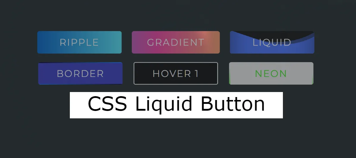
These Liquid Buttons are quite modern and attractive. You can easily use these CSS Liquid Effects on your website.
Liquid Button CSS
One trend that has gained popularity is the use of CSS liquid effects in buttons. These CSS liquid buttons add a dynamic and playful element to your website, making user interactions more engaging.
I have previously shared a step by step tutorial for making these Pure CSS Liquid Button Animation Effects. Below each design here you will find source code download button.
Animated Buttons
See the Pen Animated Buttons by Puskar Adhikari (@thepuskar) on CodePen.
Pure CSS Liquid Button Animation
See the Pen Liquid Button by Ellie (@ellie_html) on CodePen.
Liquid Button animation
See the Pen Liquid button by Luiz Ricardo Sordi (@lrsordi) on CodePen.
CSS Liquid Button
See the Pen Implementation of Liquid button by Alex (@AlexJedi) on CodePen.
CSS Liquid / Water Effects
See the Pen Liquid button by Tobias Reich (@electerious) on CodePen.
Button with Liquid Filling Effect
See the Pen Круглая жидкая кнопка by Андрей (@andrey_kulikov) on CodePen.
Liquid Button CSS
See the Pen Liquid Button Investigations by Nick Kuek (@quackkuek) on CodePen.
Comment how you like these CSS Liquid Buttons. Next time I will try to add more good Liquid Button to this list.
Before this I have created many more collection of buttons. You can see them if you want.
Creating a liquid animation on a button typically involves using a combination of HTML, CSS, and possibly JavaScript or a JavaScript library for animations.
Below is a simple example using HTML and CSS. This example uses the anime.js library for animations. Make sure to include the anime.js library in your project if you decide to use it.
HTML Code:
<!DOCTYPE html>
<html lang=”en”>
<head>
<meta charset=”UTF-8″>
<meta name=”viewport” content=”width=device-width, initial-scale=1.0″>
<link rel=”stylesheet” href=”styles.css”>
<title>Liquid Animation on Button</title>
</head>
<body>
<button class=”liquid-button” onclick=”animateButton()”>Click me</button>
<script src=”https://cdnjs.cloudflare.com/ajax/libs/animejs/3.2.1/anime.min.js”></script>
<script src=”script.js”></script>
</body>
</html>
CSS Code:
body {
display: flex;
justify-content: center;
align-items: center;
height: 100vh;
margin: 0;
}
.liquid-button {
position: relative;
padding: 10px 20px;
font-size: 16px;
border: none;
cursor: pointer;
background-color: #3498db;
color: #fff;
border-radius: 5px;
overflow: hidden;
}
.liquid {
position: absolute;
background: radial-gradient(circle, #3498db, transparent);
transform: scale(0);
animation: ripple 0.6s linear;
}
@keyframes ripple {
to {
transform: scale(4);
opacity: 0;
}
}
JS Code:
function animateButton() {
const button = document.querySelector(‘.liquid-button’);
// Create a liquid element
const liquid = document.createElement(‘span’);
liquid.className = ‘liquid’;
// Append the liquid element to the button
button.appendChild(liquid);
// Remove the liquid element after the animation completes
liquid.addEventListener(‘animationend’, () => {
button.removeChild(liquid);
});
// Trigger the animation
anime({
targets: ‘.liquid’,
duration: 600,
easing: ‘easeOutQuad’,
complete: () => {
// Perform any other actions after the animation is complete
console.log(‘Button clicked!’);
},
});
}
Here’s an example of a pure CSS liquid button animation:
HTML Code:
<button class=“liquid-button” onclick=“void(0)”>Click me</button>
CSS Code:
body {
display: flex;
justify-content: center;
align-items: center;
height: 100vh;
margin: 0;
background-color: #f0f0f0;
}
.liquid-button {
position: relative;
padding: 15px 30px;
font-size: 16px;
border: none;
cursor: pointer;
overflow: hidden;
background-color: #3498db;
color: #fff;
border-radius: 5px;
outline: none;
}
.liquid-button:before {
content: ”;
position: absolute;
top: 50%;
left: 50%;
transform: translate(-50%, -50%);
width: 100%;
height: 100%;
background: radial-gradient(circle, #3498db, transparent);
border-radius: 50%;
transform-origin: center center;
transform: scale(0);
opacity: 0;
transition: transform 0.5s ease-out, opacity 0.5s ease-out;
}
.liquid-button:hover:before {
transform: scale(4);
opacity: 1;
}
This example uses the :before pseudo-element to create a liquid effect. The :hover state is utilized to trigger the liquid animation when the button is hovered. Adjust the styles as needed to fit your design preferences.