
A responsive automatic image slider is a popular feature used on websites to showcase images or content in an interactive and dynamic way.
In this article I will tell you how to create Responsive Automatic Image Slider. Here html css and some javascript are used. But no reason to worry. The javascript used here is much simpler.
The slider can automatically cycle through a set of images or content, or allow users to navigate between them manually with arrows or dots.
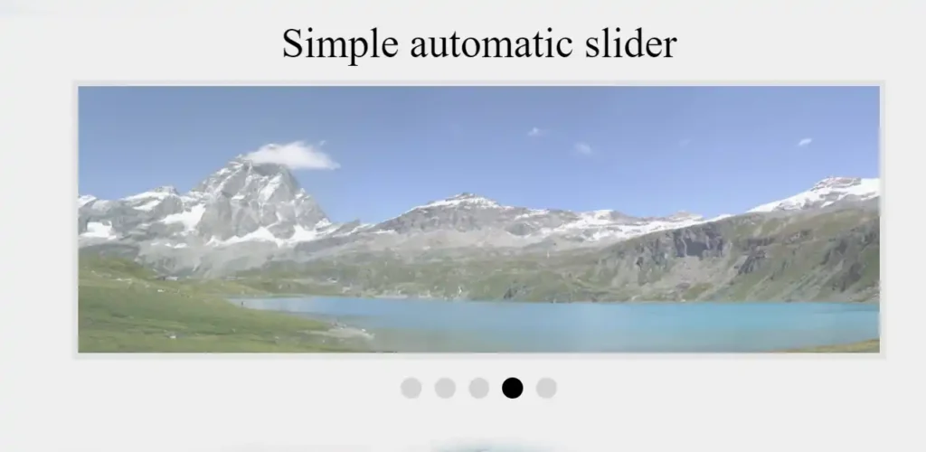
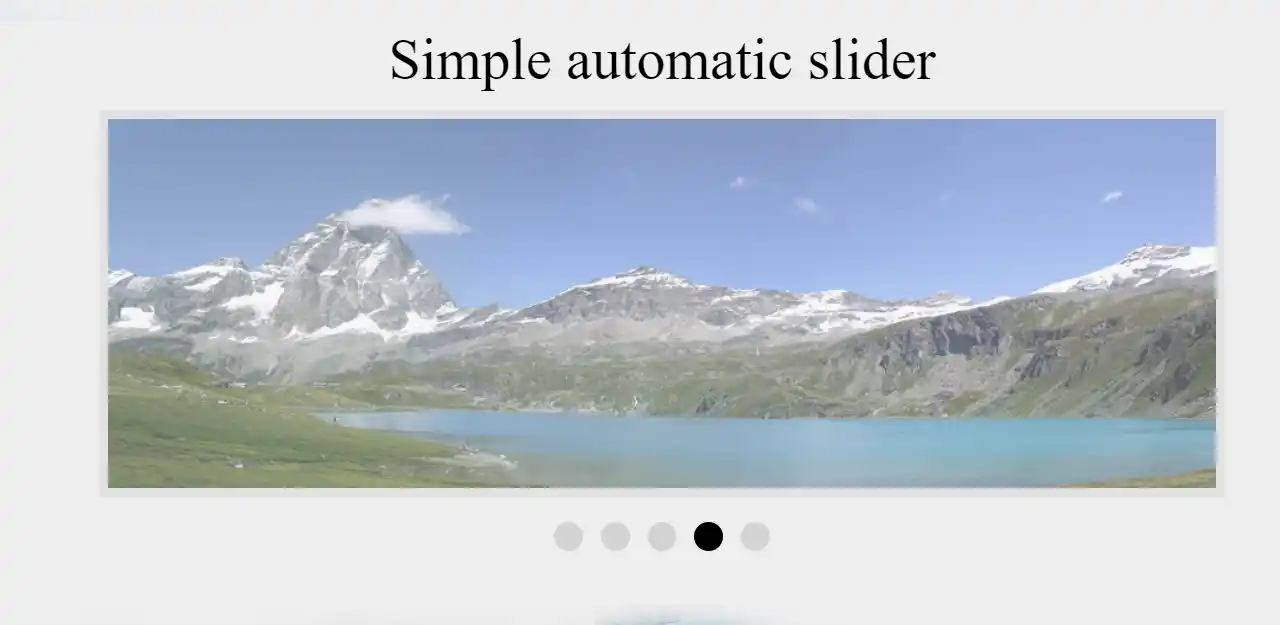
Responsive Automatic Image Slider
To create a responsive automatic image slider in HTML and CSS, you will need to use a combination of HTML, CSS, and JavaScript. Earlier I have shared many image slider designs with you but this is fully Responsive Automatic Image Slider.
The HTML will define the structure of the slider, including the container and individual slide elements. The CSS will be used to style the slider and make it responsive, ensuring that it looks good and functions properly on different screen sizes and devices.
The JavaScript will be used to control the slider’s behavior, including the automatic cycling and navigation functionality.
See the Pen Automatic image slider by backlinknn (@backlinknn) on CodePen.
When creating a responsive automatic image slider, it’s important to consider the user experience and make sure that it’s intuitive and easy to use. You should also optimize the images used in the slider to ensure that they load quickly and don’t slow down the website.
Overall, a responsive automatic image slider is a useful and visually appealing feature that can enhance the user experience on your website.
Responsive Automatic Image Slider in HTML CSS
The following codes are the html code by which the basic structure of the image slider and the images are added. Added 6 images here.
Responsive Automatic Image Slider is designed using below css. Very basic css is used here. Because I used javascript to activate the slider.
Now it’s time to activate this Responsive Automatic Image Slider with JavaScript. Here I just used some javascript. I have explained all the JavaScript used in this Responsive Automatic Image Slider for your convenience.
This code is for a slideshow that automatically changes slides every 2 seconds. It starts by declaring a variable called “index” and setting its value to 0. Then it selects all elements with the class name “slides” and “dot” using the document.querySelectorAll() method and stores them in the variables “slides” and “dot” respectively.
The function changeSlide() is then defined. It checks if the value of “index” is less than 0, it sets it to the last index of the slides array. If it is greater than the last index, it sets it back to 0. This ensures that the slideshow loops back to the beginning after displaying the last slide.
The function then loops through all the slides and sets their display property to “none” and removes the “active” class from all the dots. It then sets the display property of the current slide (at the index position) to “block” and adds the “active” class to the current dot. Finally, it increments the index by 1 and sets a timeout of 2000 milliseconds (2 seconds) before calling the changeSlide() function again.
The setTimeout() method causes the changeSlide() function to be called every 2 seconds, creating an automated slideshow effect.
Hopefully by the above codes you have learned how to create Responsive Automatic Image Slider with html css and javascript. If there is any problem in creating this Responsive Automatic Image Slider, please let me know.